Home Radar
Rethinking Housing Search for VCU Students
scroll
project summary:
A website with a human-centered approach to apartment hunting, built for students of Virginia Commonwealth University (VCU), by students at VCU
outcome
Hand-coded Website
role
user research, web design, front-end development
tools
Figma CSS HTML JavaScript Jekyll Git
time period
August – December, 2022
the problem
what problems are students of VCU facing when looking for adequate housing?
The Home Radar project emerged from a Human-Centered Design class with a mission to address the housing problems faced by students of Virginia Commonwealth University (VCU) in Richmond, VA. The initial problem statement encapsulates the essence of the challenge: "Housing should be safe, clean, affordable, and accessible, but it can be extremely difficult to find that in Richmond." As the project evolved, the problem statement was refined as well:
"Unsafe, unhealthy, and unaffordable housing options plague Richmond."
To tackle this problem, our team employed agile methodologies and sprint-based work cycles to gather insights, analyze data, and craft a solution that would make a meaningful impact. As the project leader, I spearheaded user and desk research, brand development, web design, and development, while collaborating with team members on design, research, and marketing efforts.
the solution
Our response to this problem culminated in the creation of Home Radar — a website designed to empower students to make informed decisions on housing and arm them with knowledge on their rights. Through extensive research, we identified pain points and user needs, leading us to develop a multifaceted solution. The website has a host of features, including a map for location-based searches, and a comprehensive section on tenants' rights. The design prioritizes accessibility and responsiveness, ensuring seamless access across various devices and web browsers.

interactive map
Interactive map with information about the location and area.
apartment ratings
Ratings based on pest control, maintenance, and management.
transparent reviews
Reviews directly from tenants, both positive and negative.
renting FAQ
Information about the responsibilities of tenants and landlords.
research & discovery
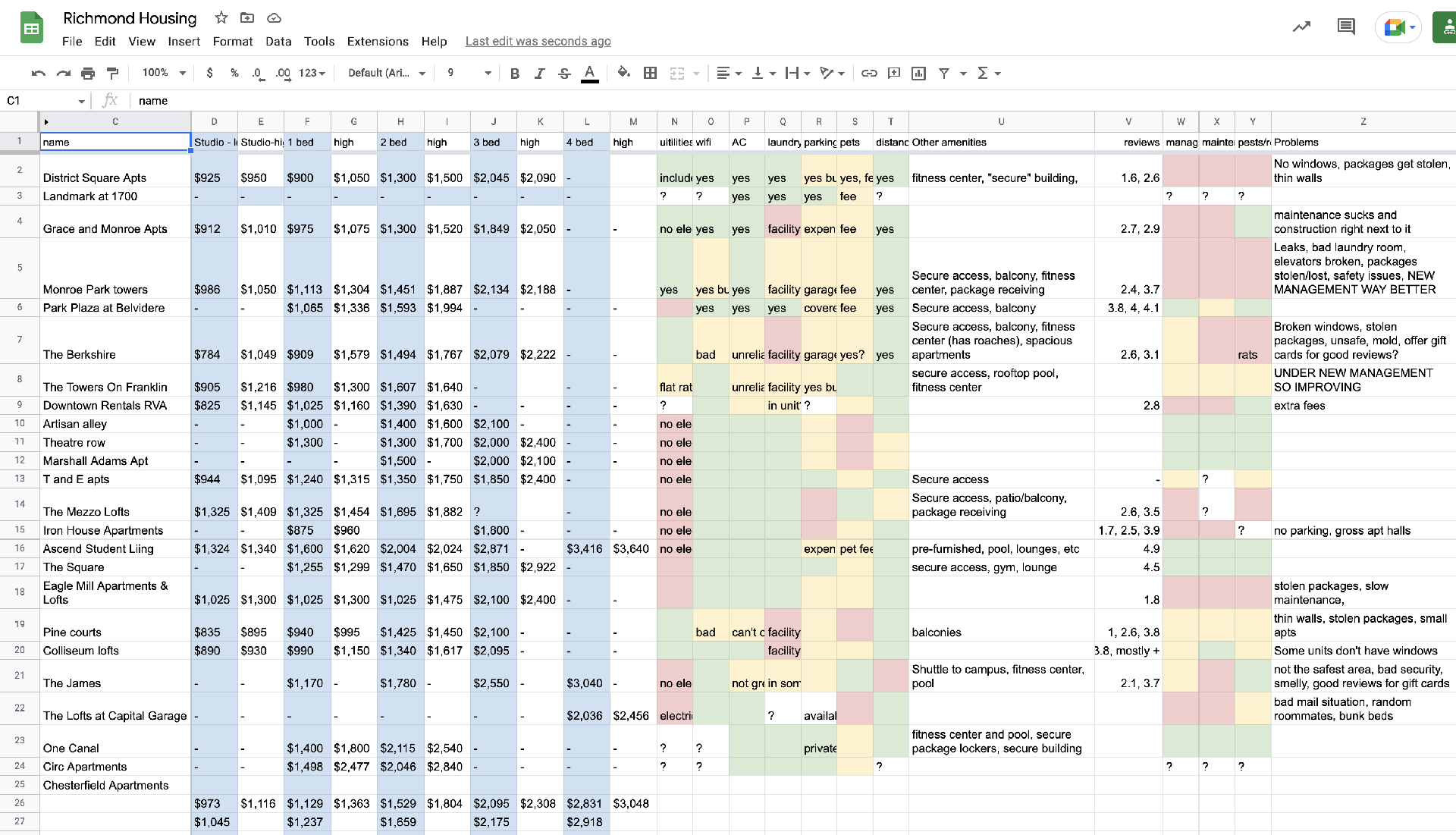
Our journey began with meticulous research. I scoured the housing landscape in Richmond and around VCU,
documenting information on rental costs, recurring expenses, amenities, and the quality of management for
various apartments. If online data proved insufficient, I reached out to apartment managers or tenants for
clarification.
Simultaneously, my team delved into researching laws and tenants' rights in Richmond, compiling a
comprehensive knowledge base.
user interviews
To deepen our understanding, we conducted surveys and over 50 in-person interviews with current renters. We asked about their experiences and opinions regarding safety, cleanliness, and affordability, gauging their emotions in the process. Our questions explored various aspects of their housing, including security, pricing, initial conditions, and maintenance processes. This extensive data collection allowed us to identify prevalent issues across different apartment buildings.
misinformation
Tenants encountered misleading advertisements and false promises from apartment listings.
inadequate repairs
Most faced challenges in getting proper repairs, especially for major problems.
lack of knowledge
Tenants were often unaware of their rights regarding repairs, rent payment, and other aspects of renting.
cost-effectiveness
Tenants felt that their apartments were too expensive for the services & amenities provided.
ideation
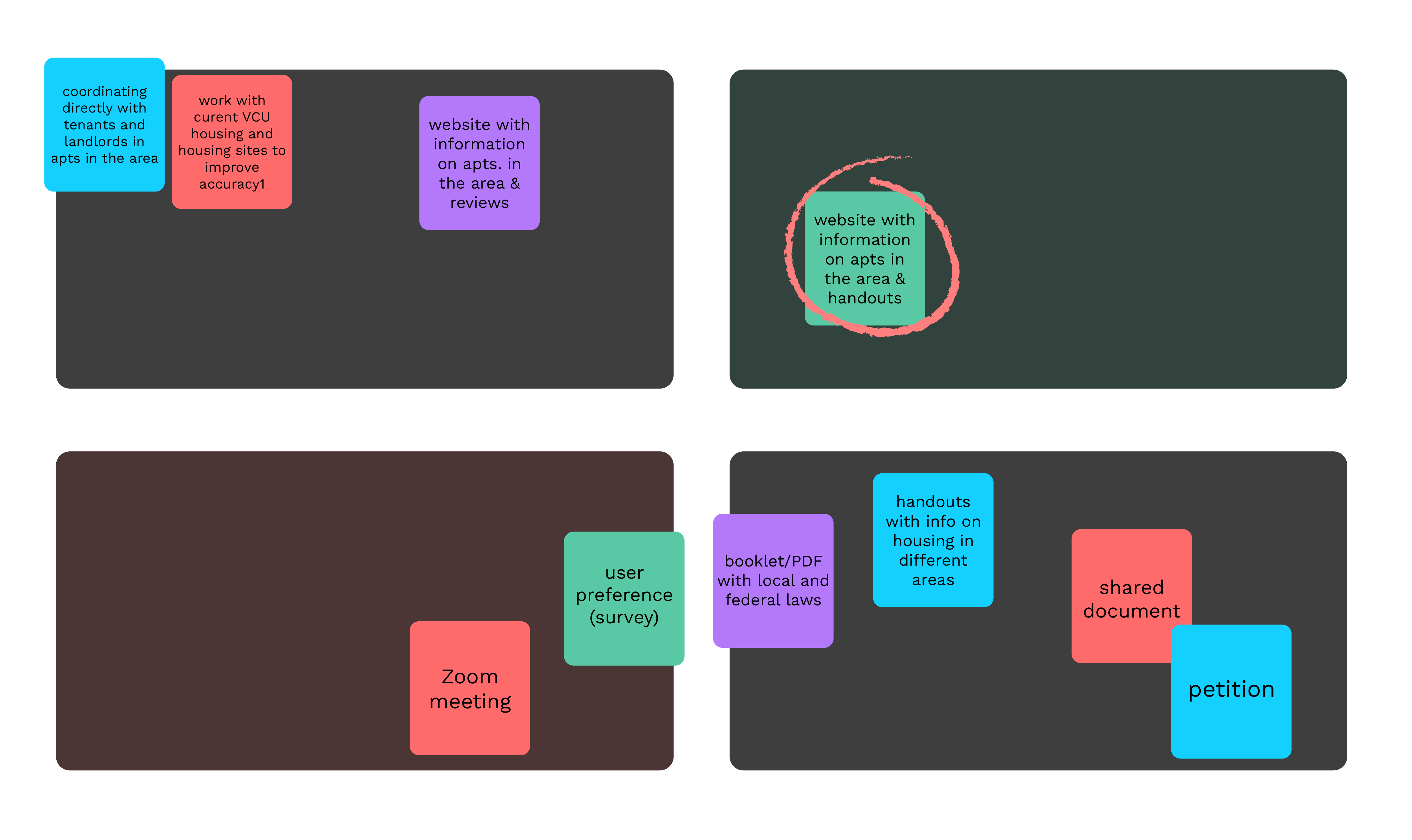
Now that we had identified the problem, we had to figure out what we were actually going to do about it
within the constraints of the project. We considered many different options, such as petitions,
informational handouts, and working with the local government, VCU student housing, or popular apartment
listing sites to work on these housing issues.
In the end, we decided to create a website with our own information because we thought that having all
of our information in one place and doing our own research might be more effective in our time period
than trying to create change on a larger scale. We also figured a website would be timeless – it will
always exist as a resource, whereas pamphlets or anything physical may be lost by users.
features
We went through all possible features we wanted to implement in our solution. While doing this, we had to also consider our constraints: a limited time period, only one web developer, and working around the schedules of our users for regular interviews and testing.
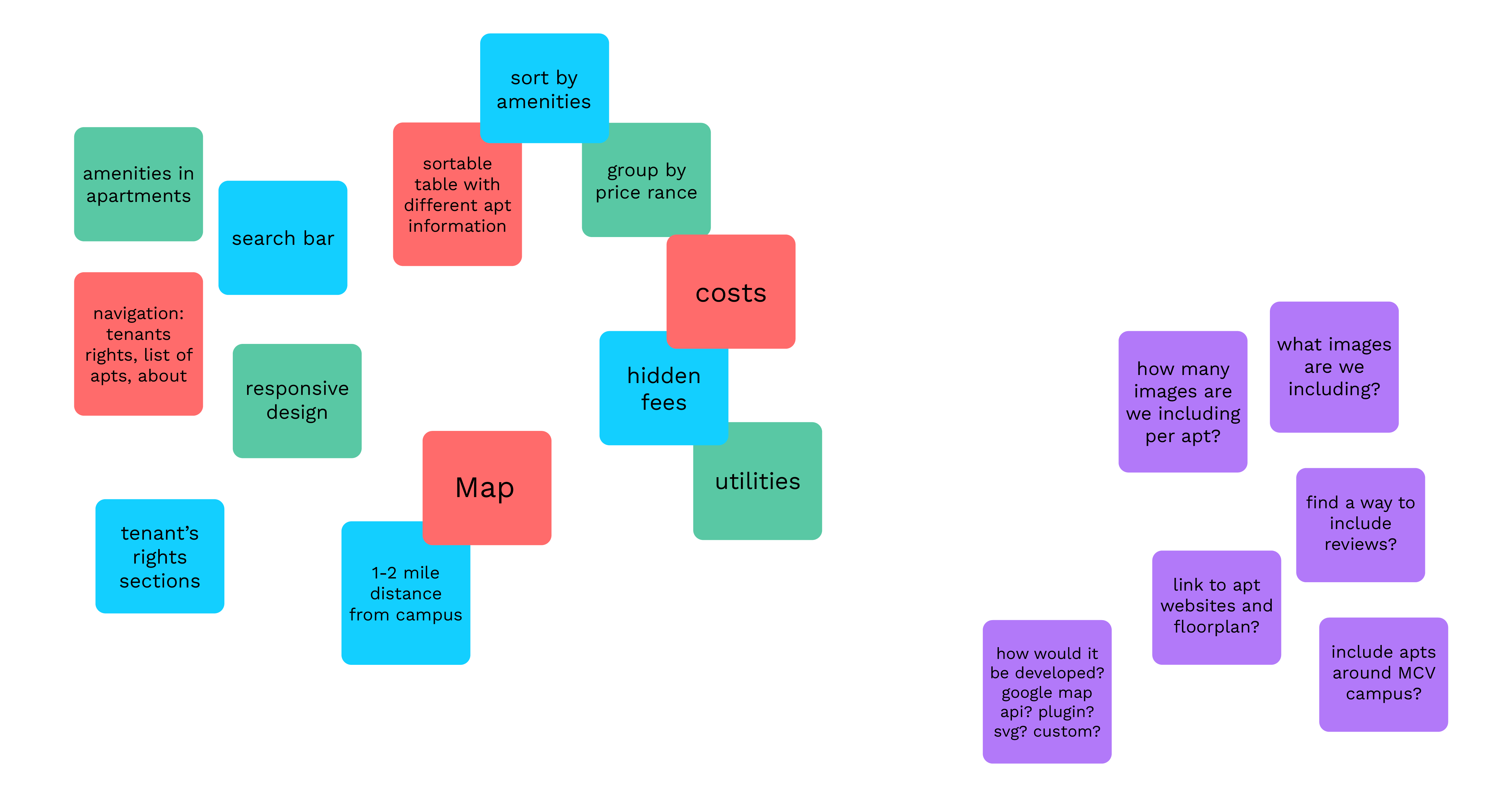
We were able to finalize our key features, including:
- A tenant's rights section, covering Richmond and Virginia laws
- An interactive map displaying apartment locations for proximity to campus
- A sortable table for personalized searches
- Mobile and web compatibility
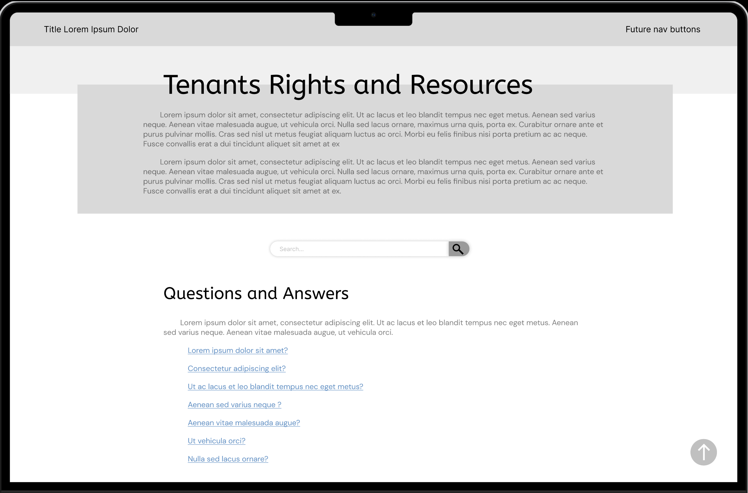
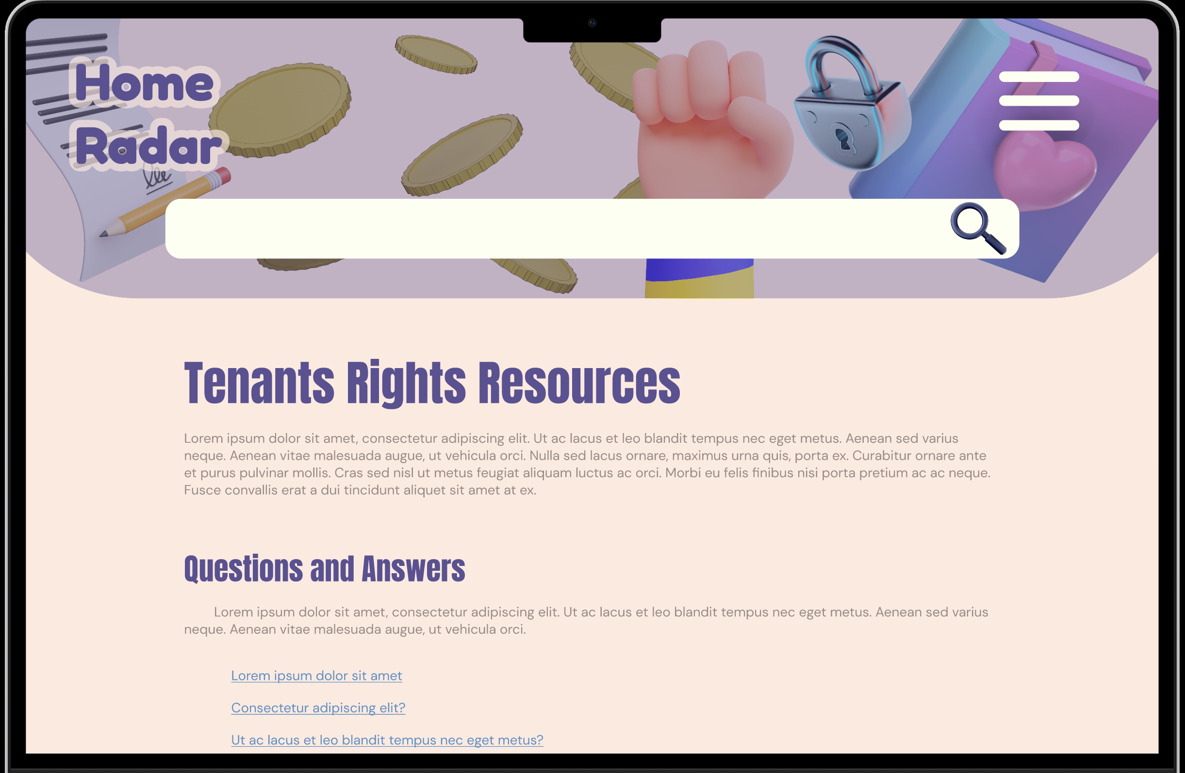
When originally prioritizing our features, we though that the tenants rights section would be most important. We created low and mid-fidelity prototypes of the sections, but after discussing and testing with users, found that the interactive map was far more useful and interesting to our user base. From there, our focus shifted again towards how to best implement this feature.
branding
We settled on a light and airy design style, crafting a color palette and brand identity that resonated with our vision. This aesthetic guided the creation of our final website.
click through to learn more about our branding process

colors
Our unique pallet is a mix of bright, friendly, and dusky tones. The primary colors, cream and pink, give the site a warm and comfortable feeling, while the teal color functions for call outs and important information. The remaining green and blue are used for text and color blocks.
typography
Worem ipsum dolor sit amet, consectetur adipiscing elit. Etiam eu turpis molestie, dictum est a, mattis tellus. Sed dignissim, metus nec fringilla accumsan.
logo creation
Worem ipsum dolor sit amet, consectetur adipiscing elit. Etiam eu turpis molestie, dictum est a, mattis tellus. Sed dignissim, metus nec fringilla accumsan, risus sem sollicitudin lacus, ut interdum tellus elit sed risus.
graphics & illustrations
In order to further push the friendliness of our site, we included hand drawn graphics, as well as familiar images from around Richmond and VCU campus. We collaborated on the style of the graphics, and the drawings were made by one member of the group for consistent style.
final product
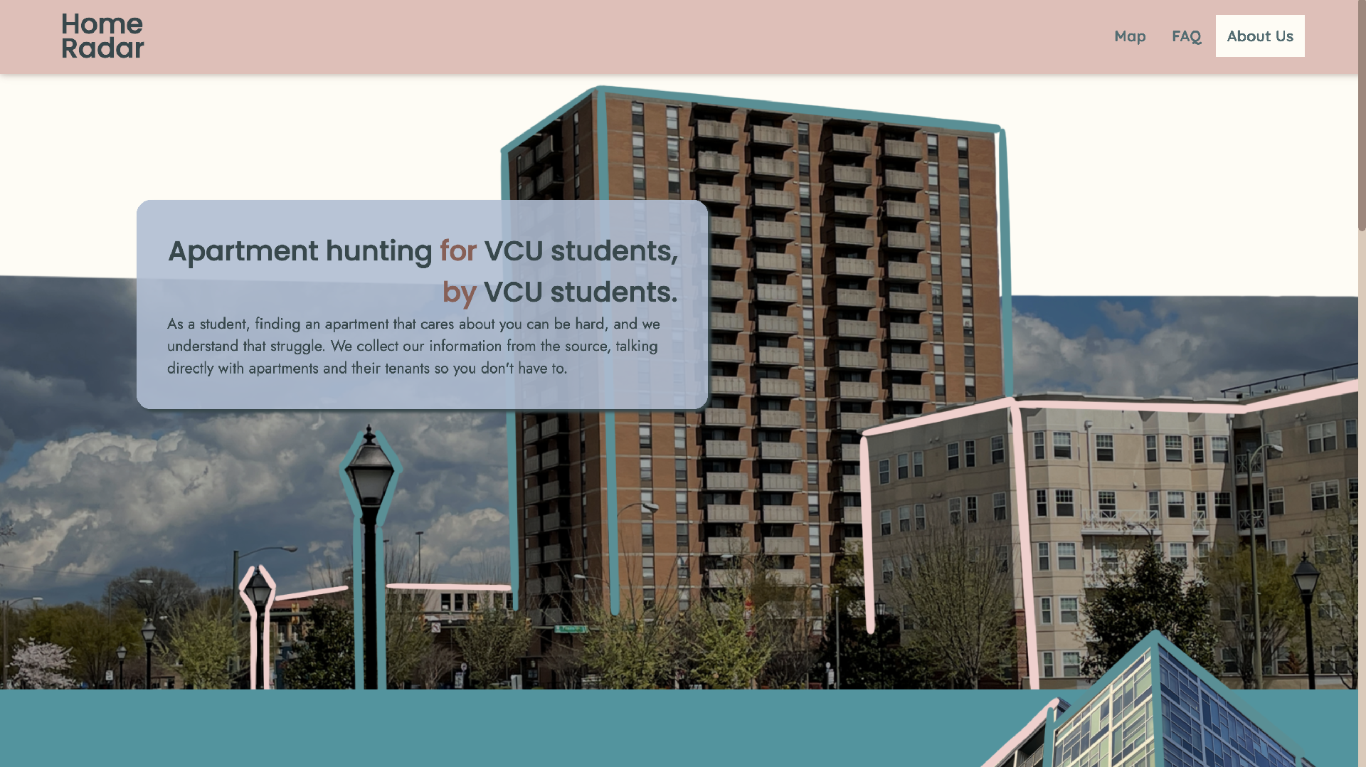
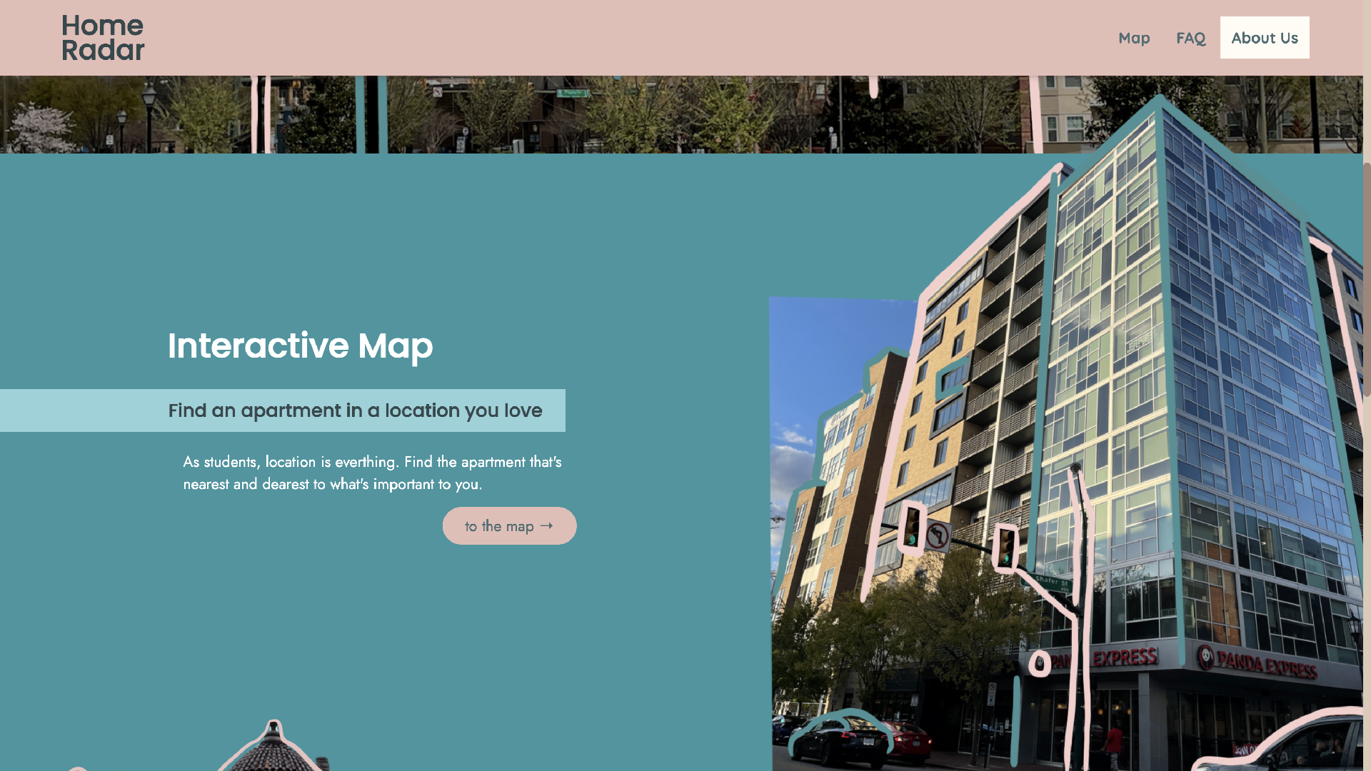
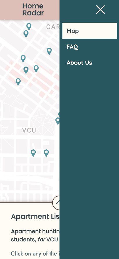
In order to achieve our final product, I began hand-coding the website. This process included learning Jekyll, a program that works with Github Pages to build out websites. I built a functional map, set up a sortable table with the data we accumulated in the research phase, made it a responsive for mobile, tablet, and computers, and compatible with multiple browsers (Safari, Chrome, IE, etc).
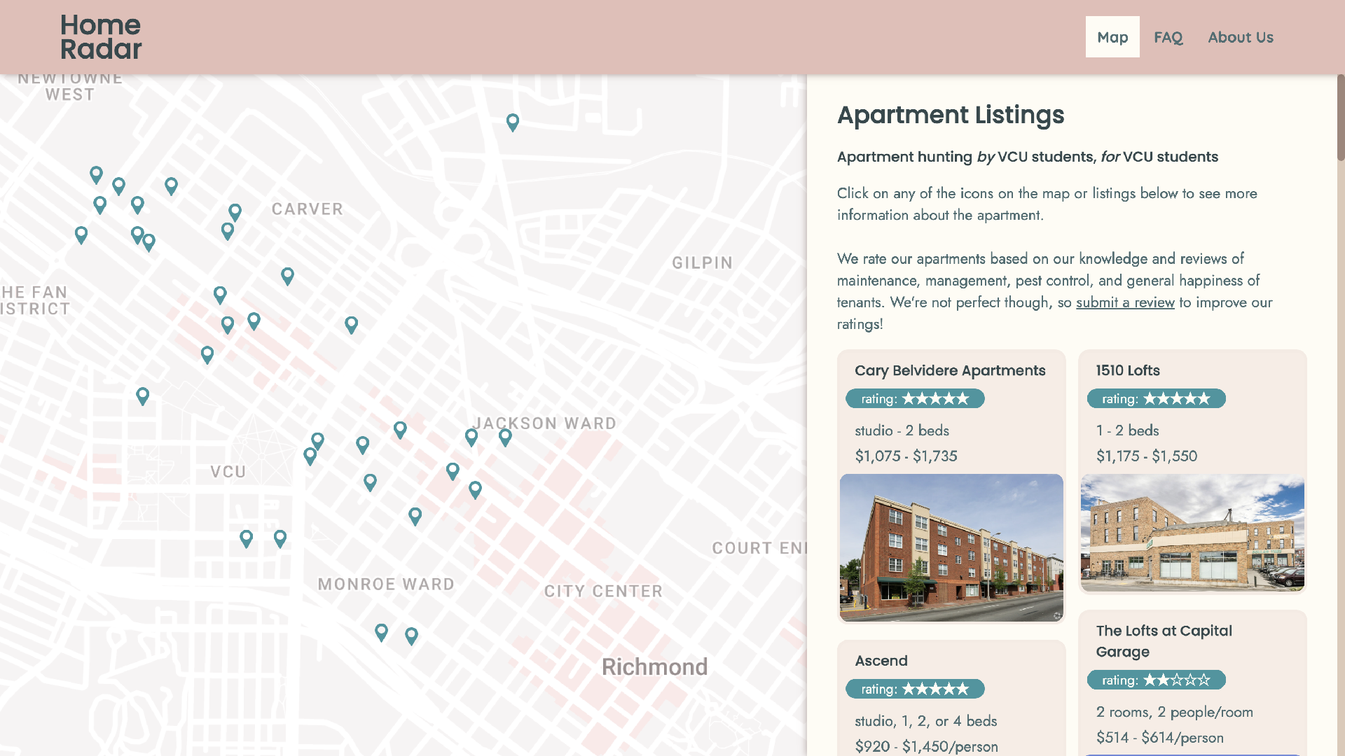
final home page and map

responsive mobile home navigation
responsive mobile home navigation
responsive mobile home page
responsive mobile home page
responsive mobile home navigation
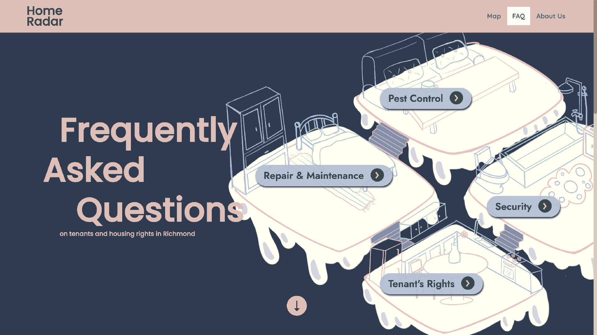
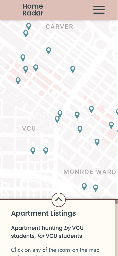
The map functionality allows for hovering over data points to display names of locations, which users could click on to pull up our data page for that apartment building. I implemented ratings for each location based on data from our interviews and research, scoring each rental with an overall score as well as a score for maintenance, management, and pest control. I also added general information about the location, such as distance from the VCU Compass, the address, the management company, and links to the rental company’s website. We also have a functional FAQ page, which utilized accordions for easier readability. We focused on information that people were more often unaware of during interviews. We also included a section where users could submit a review for their current rental.
After doing another round of user testing, we made a few updates based on their feedback. We updated the website reviews from being out of 3 stars to being out of 5 stars. We also made some tweaks to the design such as increasing the font size, left-aligning all of the text, and redirecting the user towards the map.